« a brief history of the cinema | Main | a place to relax »
September 15, 2010
lead and steel
working on a typographic sculpture for a lead mine in North Yorkshire. A 5m high by 1m wide piece of COR-TEN steel, lasercut with some of the words used when extracting lead from the ground in the eighteenth century.
First decide the typeface. Serif would be good for the general connection and holding-togetherness of the letters, but not good for the laser cutting head which doesn't like pointy bits.
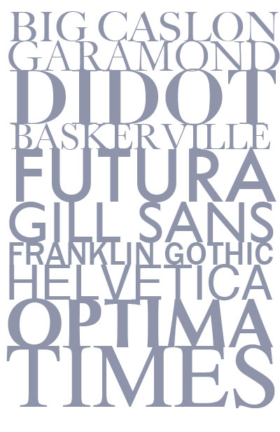
I went with Optima Extra Black as it has both thickness and softness with no pointy bits.
Next, stack the words on top of each other and swap around to give a good balance of large and small words, then adjust the individual letter sizes so that everything is as connected to everything else as possible. Not as easy as it sounds.
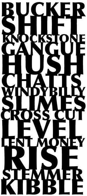
the top half of the design
All this is done in Adobe Illustrator then exported as a CAD file and sent to the engineers. They send back the cutting drawing:
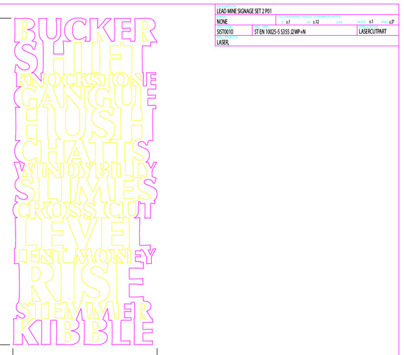
I'm currently thickening up some of the connections on the edges to prevent little fingers bending the finished piece. Mind you in 6mm COR-TEN steel they'll need to be fairly strong little fingers.
Posted by john at September 15, 2010 11:41 AM
Comments
"Not as easy as it sounds" - - HAH! Didn't sound at ALL easy. But I bet it will look great.
Posted by: Daphne at September 16, 2010 12:17 AM